
returns by year
Calendar-year, monthly and weekly total returns for the S&P 500 (proxied by SPY, dividends reinvested) since 1994. The most recent year is year-to-date.
S&P 500 returns by year (1994–2026)#
Calendar-year returns with each year's path and its dividend contribution (dividend return = total minus price return).
| Year | Path | Dividend | Total return |
|---|---|---|---|
| 2026YTD | +0.3% | +10.1% | |
| 2025 | +1.4% | +17.7% | |
| 2024 | +1.6% | +24.9% | |
| 2023 | +1.9% | +26.2% | |
| 2022 | +1.3% | -18.2% | |
| 2021 | +1.7% | +28.7% | |
| 2020 | +2.2% | +18.3% | |
| 2019 | +2.4% | +31.2% | |
| 2018 | +1.8% | -4.6% | |
| 2017 | +2.3% | +21.7% | |
| 2016 | +2.3% | +12.0% | |
| 2015 | +2.0% | +1.2% |
Total return by period
Methodology#
Returns are total returns (dividends reinvested), computed from SPY's split- and dividend-adjusted closes — a standard proxy for the S&P 500. The bar chart switches between annual and monthly periods. Annualized return is the compound annual growth rate over the full period. The current year is year-to-date. See also the periodic table of returns. Past performance does not predict future returns; not investment advice.
FAQ
- What is S&P 500's average annual return?
- Since 1994, the S&P 500 (proxied by SPY, dividends reinvested) has returned about 10.6% a year (the compound annual growth rate) and an average calendar-year return of 12.1%.
- What were S&P 500's best and worst years?
- Over 1994–2026, the best year was 1995 (+37.3%) and the worst was 2008 (-36.8%).
- How often is S&P 500 up in a year?
- 25 of the 32 full years since 1994 were positive — about 78% of the time.
More visualizations
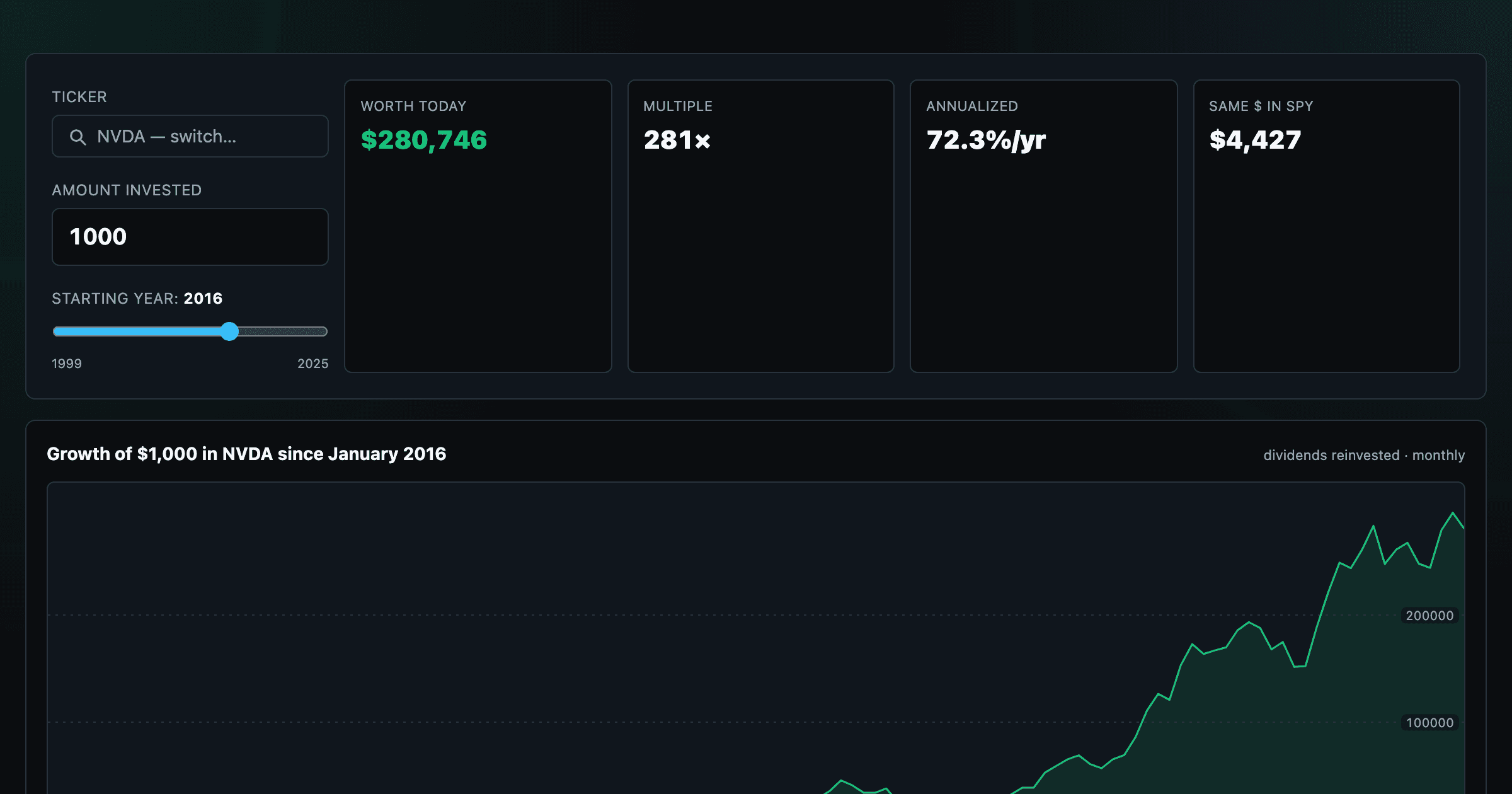
What $1,000 in any stock or ETF would be worth today.
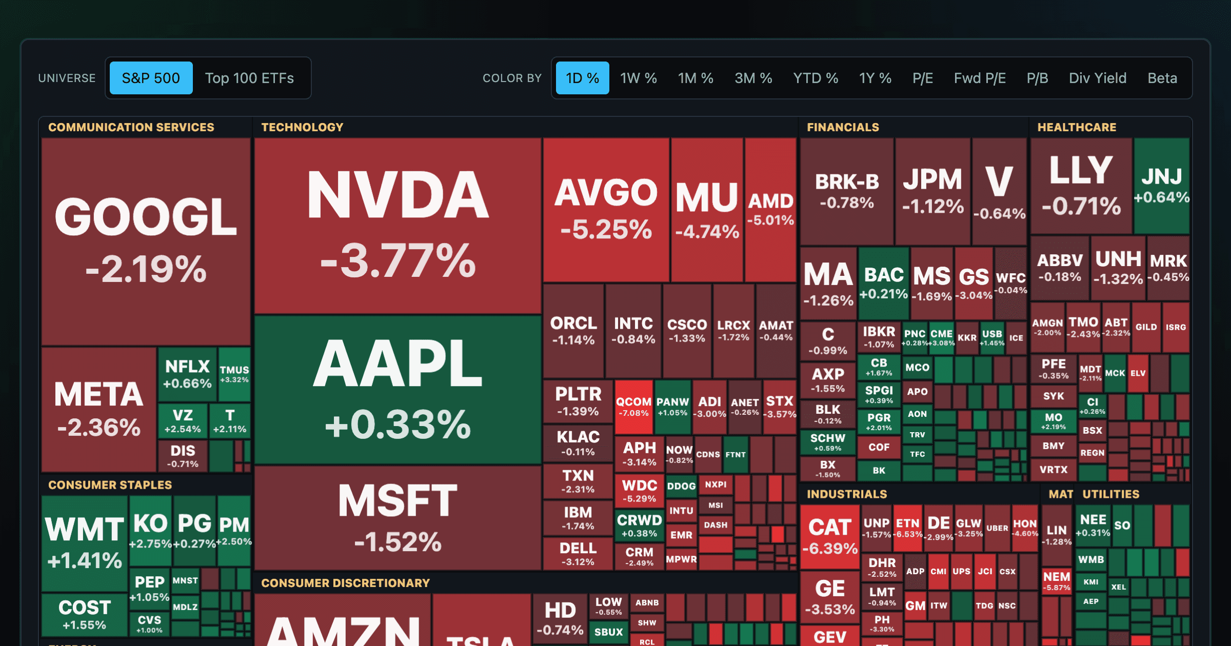
Every S&P 500 company sized by market cap — color by return or valuation.
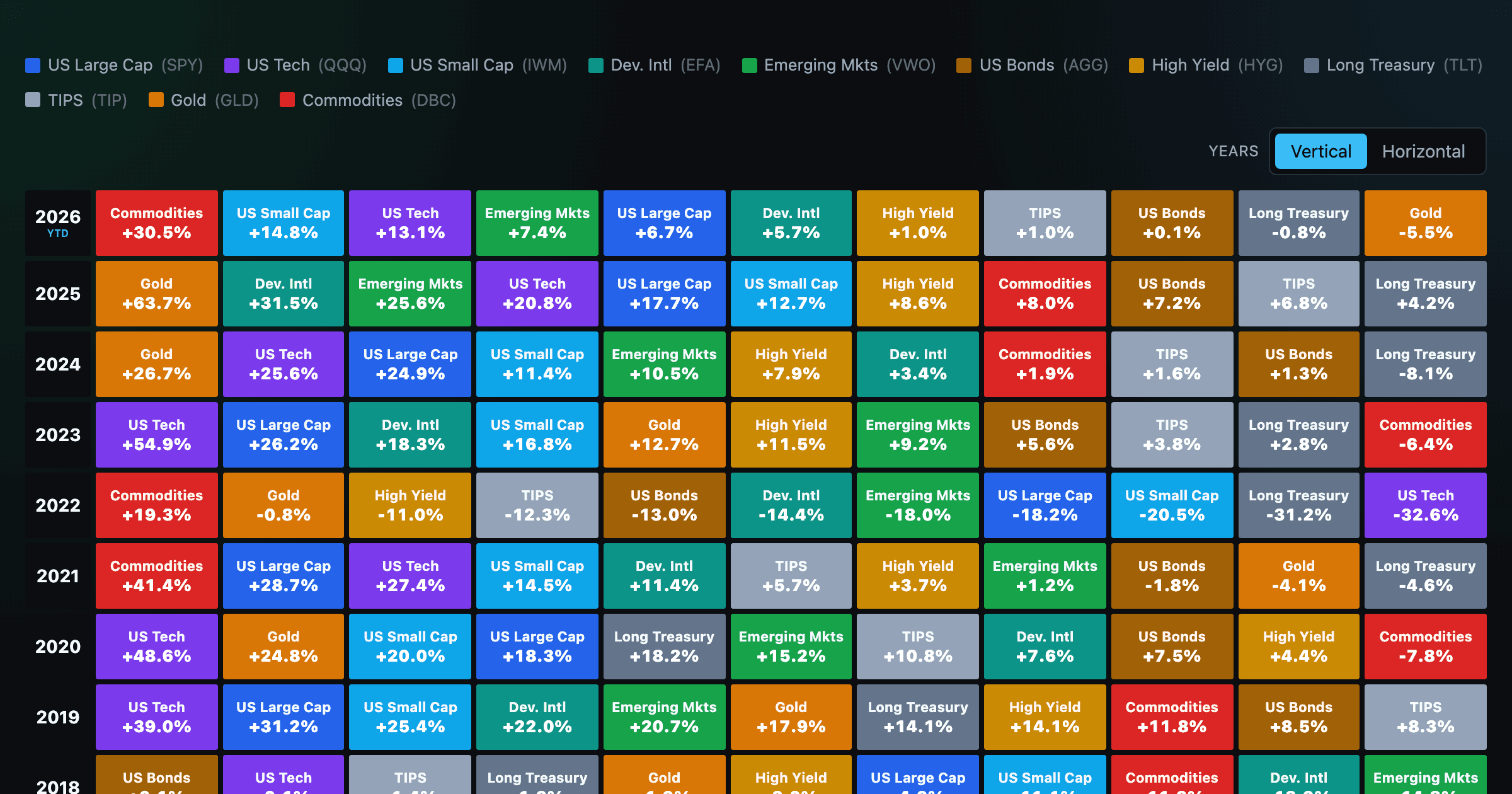
Asset-class returns ranked year by year — the Callan chart / asset allocation quilt.
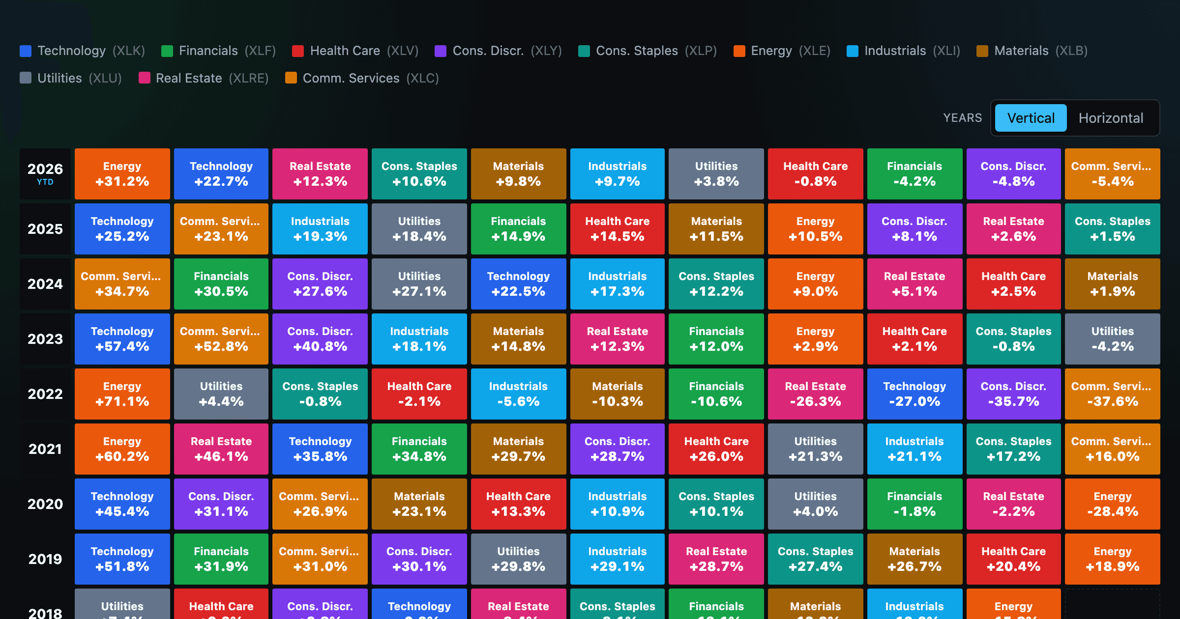
The 11 S&P 500 sectors ranked year by year — a sector quilt chart, back to 1999.
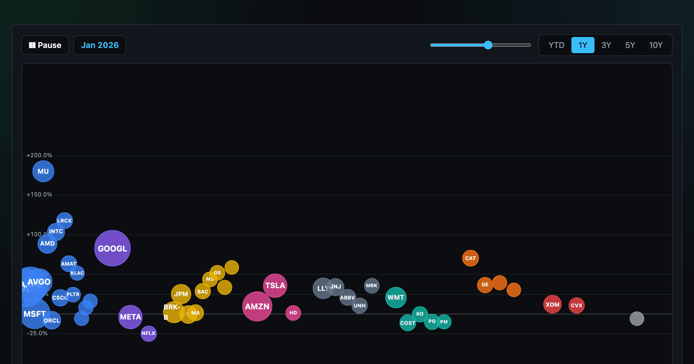
The biggest US companies as animated bubbles, rising and falling with their total return over time.
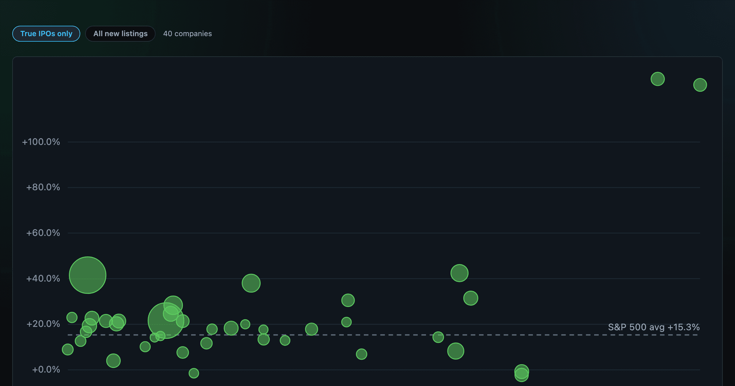
How recent stock-market debuts have performed since listing — annualized, vs the S&P 500, by IPO vs spin-off.
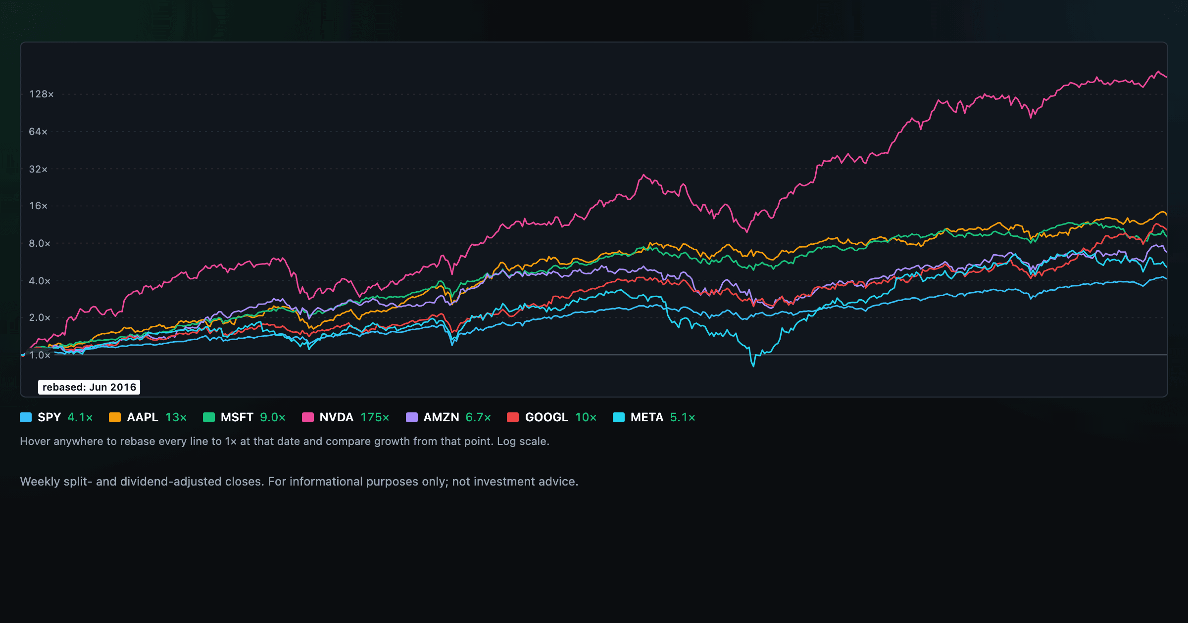
Compare megacaps vs the S&P 500, rebased to 1× at any date you hover.
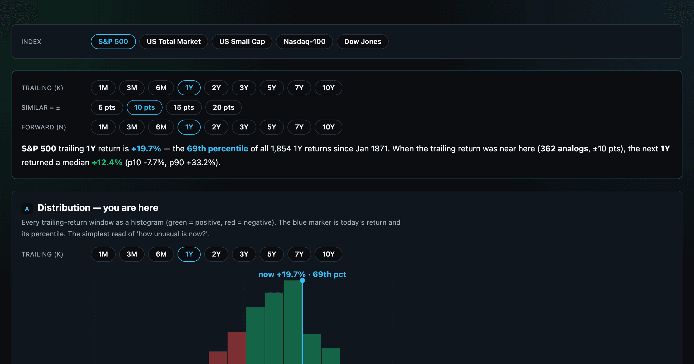
Where today's S&P 500 return ranks against all history — and the forward returns that followed similar moments.
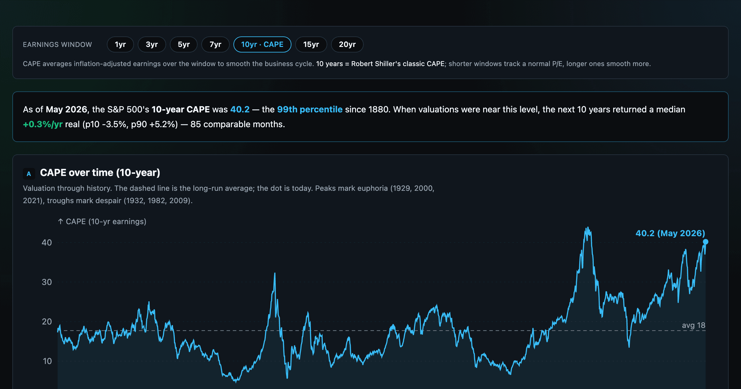
Is the market expensive? The Shiller CAPE back to 1871 and what valuations have meant for the next decade.
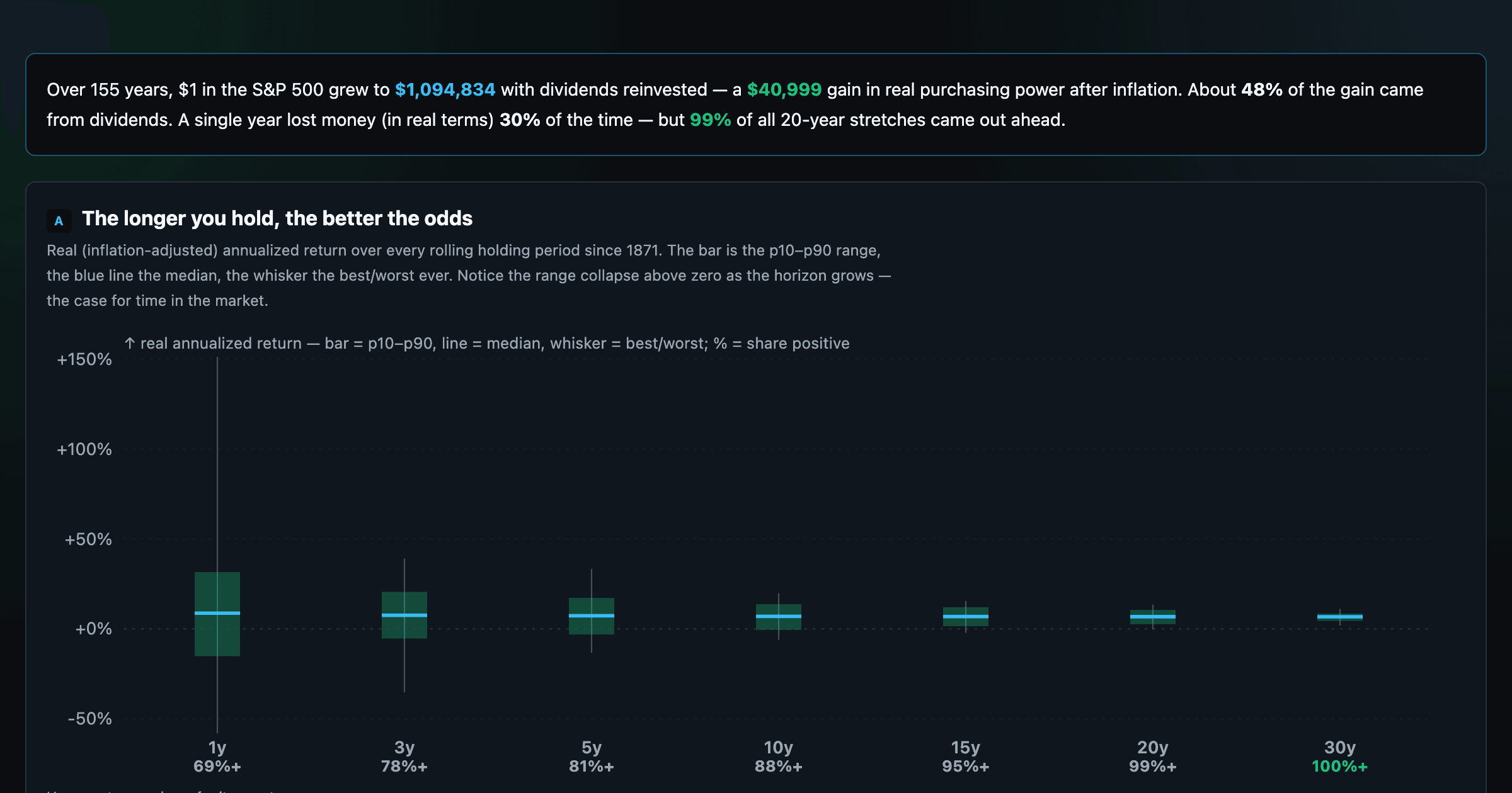
The S&P 500 since 1871 — odds of gain by holding period, real drawdowns, and the growth of $1.
Stocks trading cheapest relative to their own P/E, P/FCF, P/S, or P/B history — with fair-value bands.
Follow a company's revenue through its income statement as a Sankey — costs, taxes, and profit.
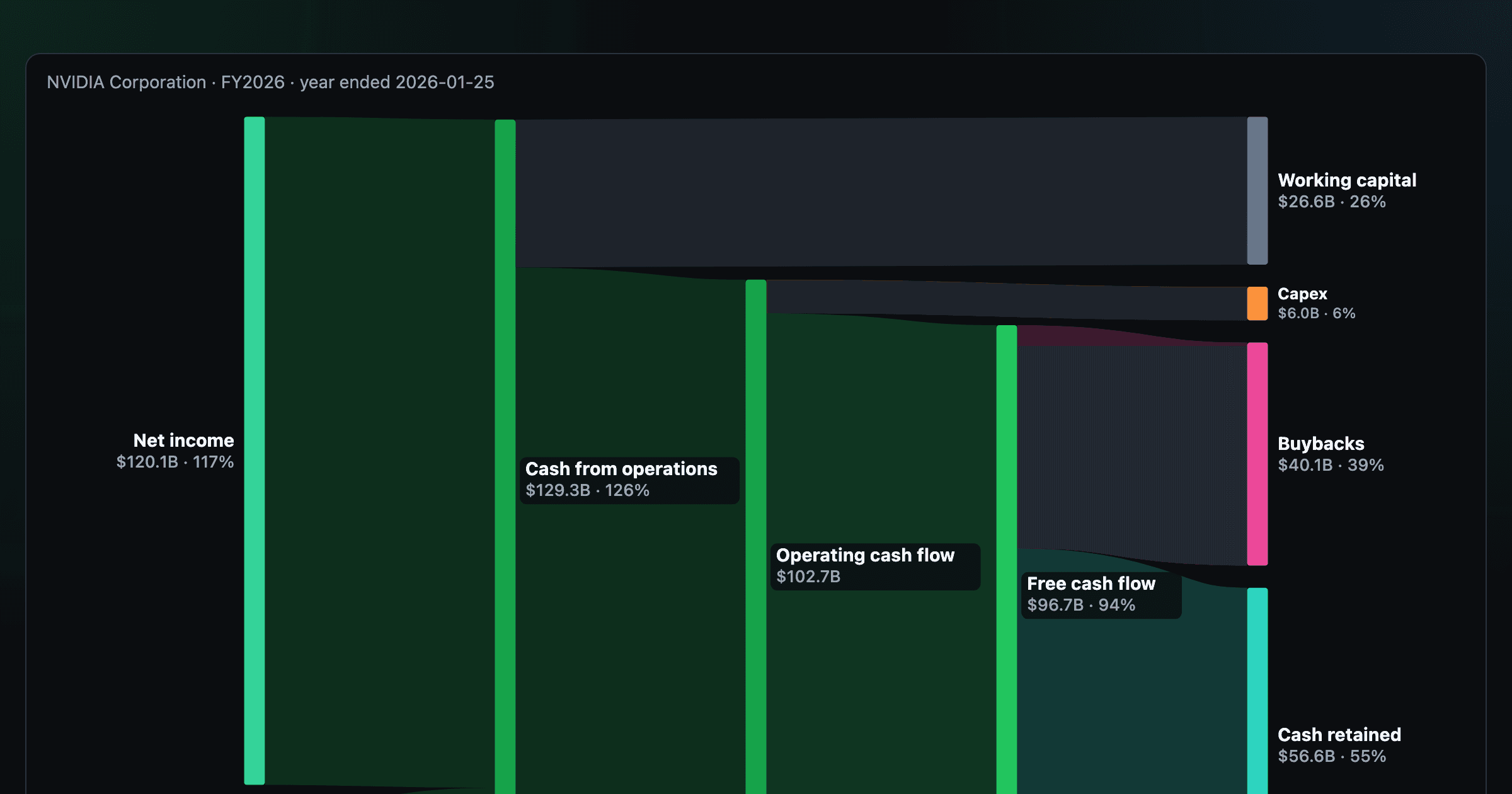
Follow a company's cash from net income through operating cash flow into capex, buybacks, and dividends.
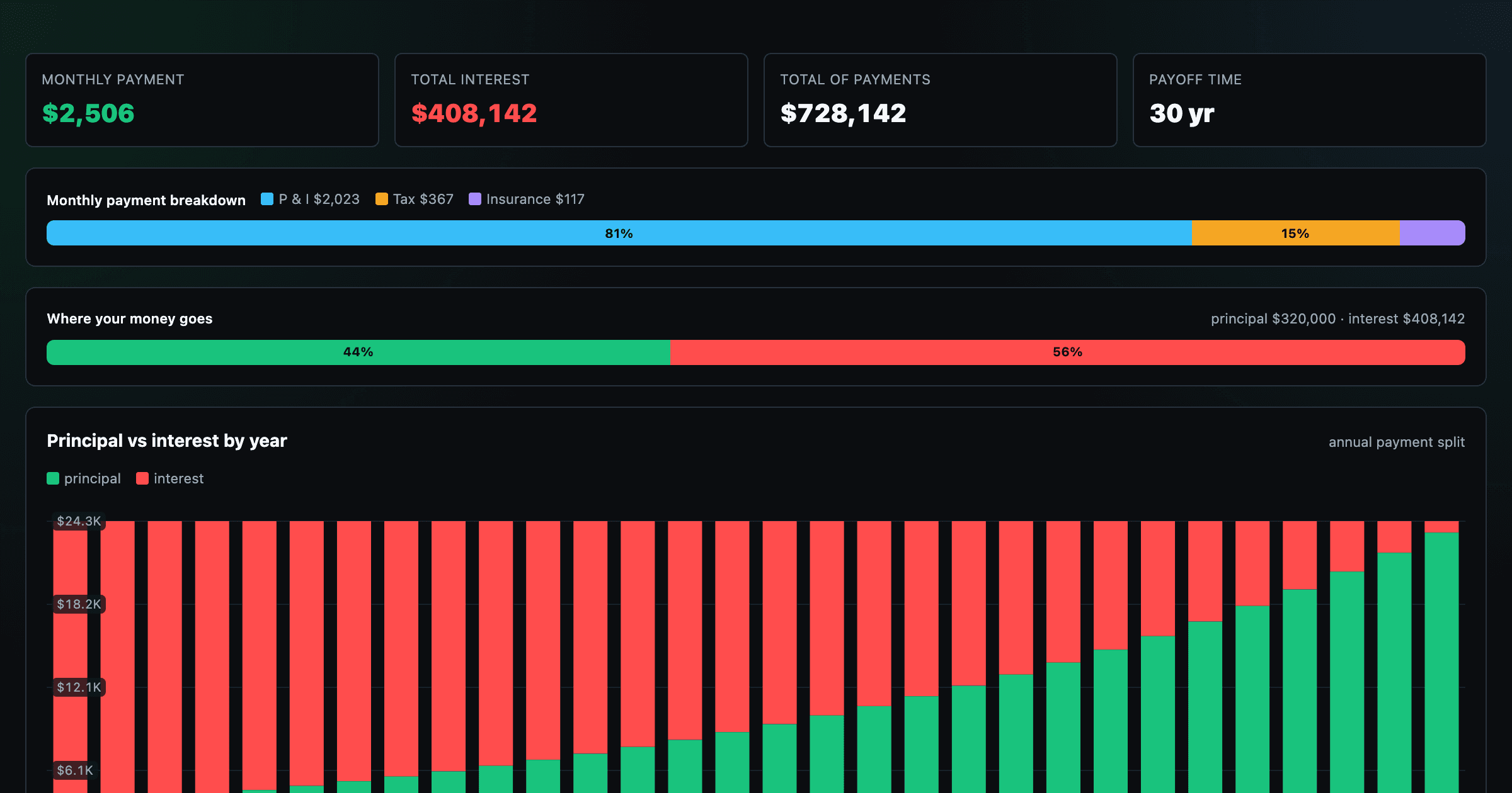
Monthly payment, principal vs interest by year, and the balance paydown — with extra-payment savings.
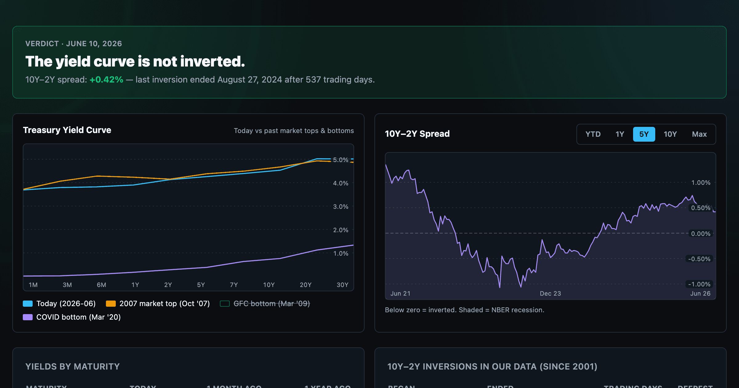
Live term structure, the 10Y–2Y spread, and every inversion episode.